Have you ever wondered how much power a single font could have on you and your perceptions? There are approximately 150,000 different fonts in use today, but we often think of them as secondary, fading into the background of our visual surroundings. But the truth is, fonts discretely sculpt how we perceive content.
For example, it’s almost impossible to take a sentence written in Comic Sans seriously, no matter what it says.
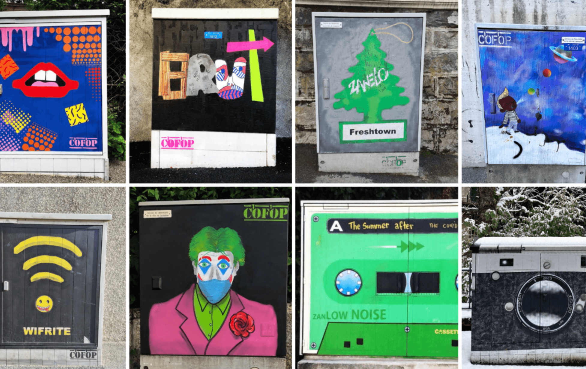
If you have been to see the most recent Ecal graduation show you may have noticed the innovative work by the students in the Masters in Type Design. This is proof that there is a whole font world out there — a world that is fundamental in how we perceive text every day.
Helvetica is one of the most commonly used and famous typefaces. (Technical interlude: A typeface is a set of glyphs – an alphabet and its corresponding symbols such as numerals and punctuation – that share a common design. A font is a sub-category within a typeface. Different fonts exist within the same typeface). Although it has been called anonymous, neutral, normal and even boring, I am pretty sure that Helvetica is the only typeface to be the subject of a feature-length, prize-winning documentary film, appropriately called “Helvetica”.
As its name suggests, Helvetica is Swiss (from the Latin word for Switzerland), and is tightly linked to the cultural heritage and traditions of Switzerland. It was commissioned by Eduard Hoffmann, the president of the Haas type foundry near Basel, and designed by Max Miedinger, a Swiss typeface designer. Their goal was to design a versatile sans-serif typeface (technical interlude: a serif is any of the short lines stemming from and at an angle to the upper and lower ends of the strokes of a letter. So, sans-serif refer to letters or typefaces that don’t have serifs). They were looking for a style that was more modern and legible than its predecessor Akzidenz-Grotesk, that had been around since the 1880. Miedinger wanted a font that was clear to the eye and could be used in a variety of ways.
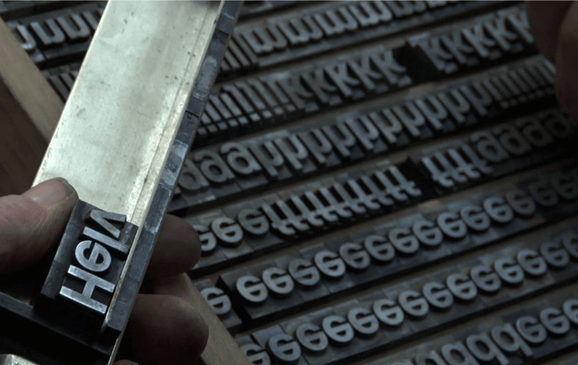
The typeface he designed was originally called Neue Haas Grotesk, and was presented to the public in June 1957 at the Graphic 57 trade fair in Lausanne. His design emphasized horizontal stroke terminals, a tall x-height, and tight tracking, giving the typeface a dense and sturdy appearance. In 1960 the font was sold to the Stempel type foundry in Frankfurt, was renamed Helvetica (a name considered more marketable internationally), and became available on linotype machines making it accessible worldwide.
While Helvetica was enjoying international success (well-known graphic designers were putting it to use for corporate identities and logos such as Otl Aicher for Lufthansa, Massimo Vignelli for American Airlines, and Knoll International, FHK Henrion for British European Airlines), in Switzerland it didn’t gain immediate success. There was a Montague and Capulet situation between graphic designers in Basel and Zurich with those based out of Basel rejecting Helvetica in favor of the slimmer and curvier Univers font, and Zurich-based designers adopted the simplicity and clarity of Helvetica. Ultimately, both the Zurich and Basel esthetics fell under the umbrella of the Swiss Style.
During the 50s and 60s, Swiss graphic design was booming and was known internationally as the ‘Swiss Style’. Appreciated for its technical precision and clarity, the Swiss Style was characterized by a design language reduced to its essentials, the use of photography and graphic symbols, little utilization of color, sans-serif fonts, and asymmetrical layouts. Helvetica was an integral part of the propagation and success of the Swiss Style.
Helvetica withstood the digital revolution with its sans-serif head held high. Stempel created Neue Helvetica in 1983 featuring adaptations to the new technologies. When IBM was denied the rights to incorporate the font into its software, it developed Arial, a close copy of Helvetica.
Some typefaces say one thing. Helvetica says everything. It is completely open to interpretation and a neutral vector to relay a message. What makes Helvetica interesting on a design level is the spacing, the figure/ground relationship, and the use of negative shapes in between the letters. The negative space holds the letters.
When you start paying attention to our typographical surroundings, Helvetica is everywhere, from the New York metro system to corporate logos across the world, posters, signage, and high-school term papers. It is the ultimate all-purpose font. Brought to you directly from Switzerland.
(If you are looking for an example of this iconic typeface, look no more. It is right in front of you. Had you noticed that this text is in Helvetica?)